New brand creation + launch system
ServiFácil
An automotive brand that feels trustworthy without feeling expensive
- Period
- 2026
- Role
- Brand Strategy, Verbal Identity and Visual Identity
- Context
- ServiFácil
- Platform
- Brand identity
- Market
- Costa Rican automotive sector
- Manual
- Brand manual version 1.0 — April 2026, 24 pages
- Authorship
- All supplied strategy, writing, identity and manual work
- Website
- Designed and built by another party
Case summary
ServiFácil was created from zero around a name the founders already owned. Starting with a structured client questionnaire, I developed the complete strategic, verbal and visual foundation, positioning the new Costa Rican venture as an honest automotive ally rather than another transactional seller.
The name ServiFácil existed before the identity work began; I did not name the company.
A category problem the founders already knew
A former coworker and friend approached me to create the brand from zero. The founders came from automotive sales and after-sales service across established vehicle brands, and described a gap between product quality and customer care: a category that often prioritizes the sale over the customer's experience, and customers who can feel taken advantage of when buying tires, lubricants, used cars or motorcycles.
I begin branding projects with a structured requirements form. For ServiFácil, that produced the factual and strategic input for the proposal: personalized advice as the main differentiator; both fleet, cooperative and insurer customers and individual buyers; and three desired attributes — excellent customer service, ease and transparency.
Positioning an automotive ally
I synthesized the client's raw inputs into a positioning centered on being an automotive ally, with a customer promise based on helping people make the right decision with clarity and confidence.
The documented brand promise centers on three principles — excellent service, ease and transparency — and a voice that is direct, honest, close and knowledgeable, without pressure, exaggerated promises or unnecessary technical language.
Exploring directions and recommending one
I explored several automotive identity directions tied to cars, lubrication, motorcycles and technical service before recommending the final concept. The front-facing car was selected because it could represent the entire automotive offer without reducing the brand to tires, lubricants or motorcycles.
The clients reviewed the alternatives and accepted the recommendation without significant changes.
The identity system
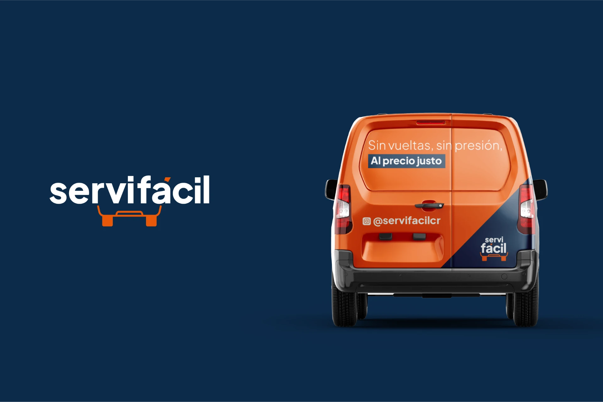
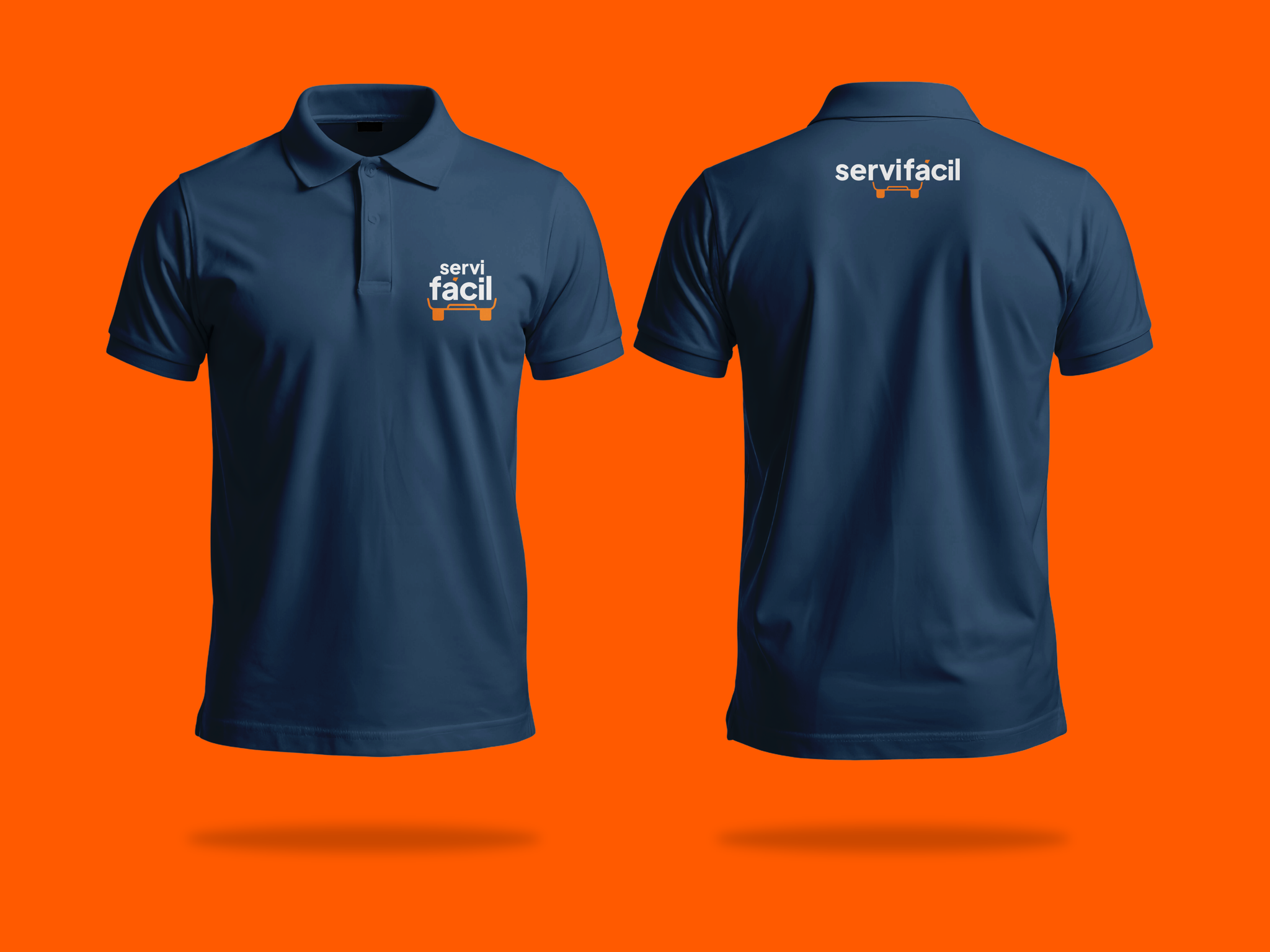
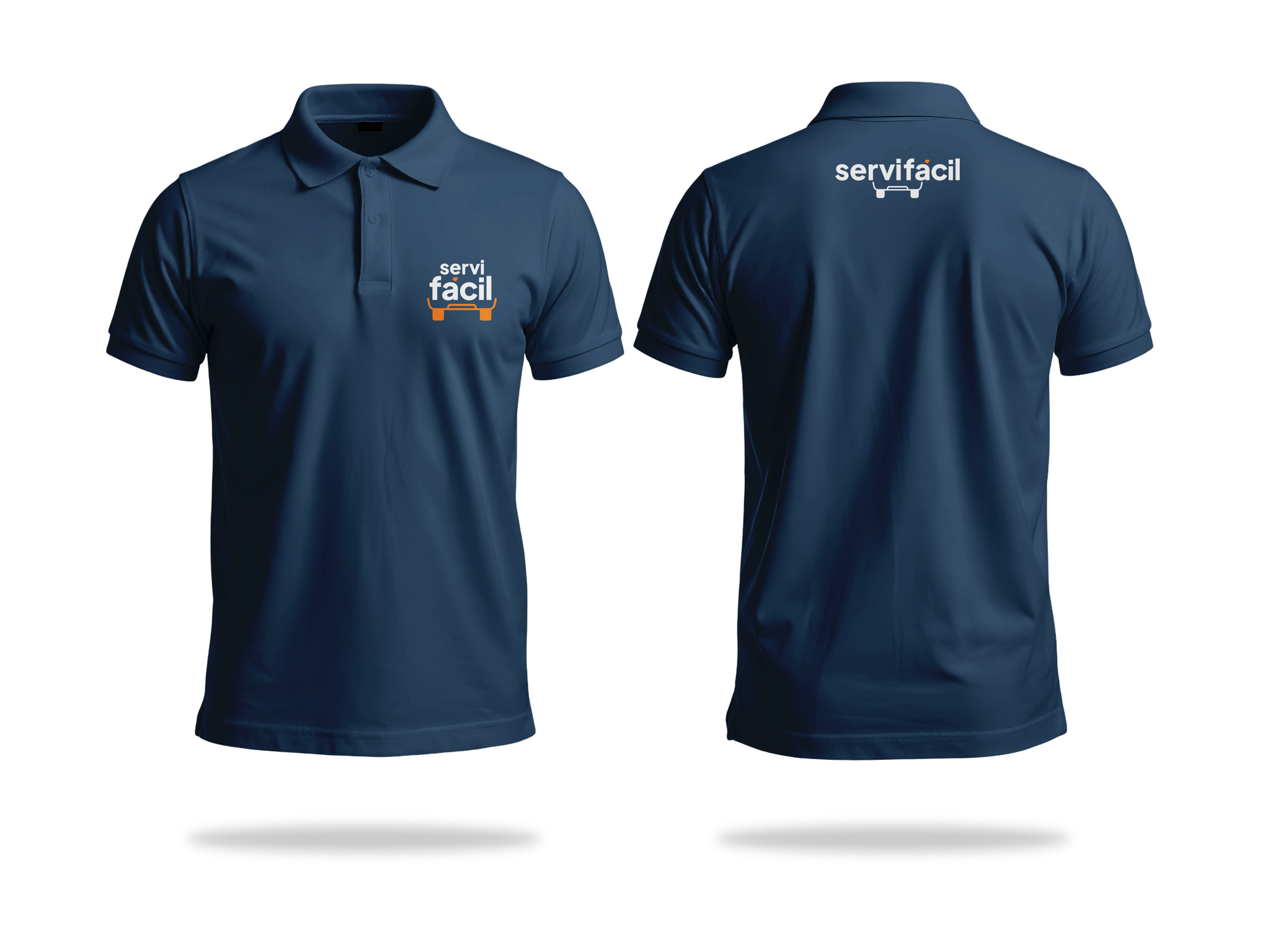
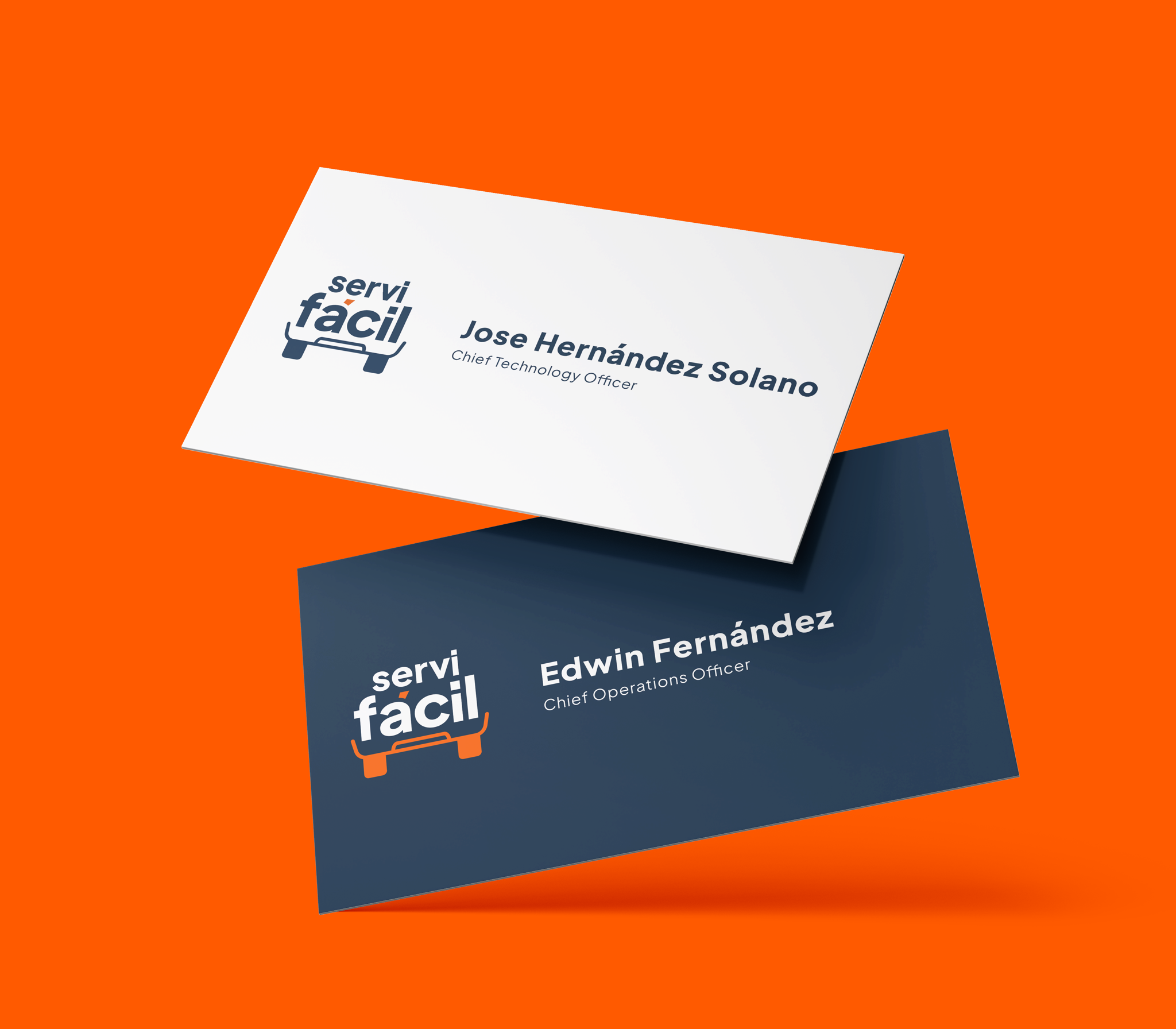
The wordmark is inseparable from a front-facing car silhouette, with an orange accent integrated into the accented á. Dark blue works as the principal structural color, green as a differentiated secondary environment, and Plus Jakarta Sans carries the typographic hierarchy.
A people-first photographic direction, based on real interactions and environments, extends the promise beyond the logo.
The central challenge was tonal
ServiFácil needed enough authority to communicate expertise and quality, but it could not look premium in a way that suggested higher prices. Balancing that tension was the hardest part of the project.
The brand entering the market
A public website created by another party already applies the identity and translates the brand promise into a guided quotation experience for tires and replacement parts: choose what is needed, provide vehicle information and receive concrete options through WhatsApp.
This is evidence that the strategy, voice and visual system are being used publicly. It is not evidence of commercial performance, and I did not design or build the website.
Visuals in this case include: Mockup.