Jetcore Logistics
A logistics identity built around direction, movement and speed
- Period:
- 2026
- Contribution:
- Logo and Visual Identity Design
Case summary
The client brought the Jetcore name and several AI-generated sketches, a type of starting point that has become increasingly common in identity projects. From that material, I developed a distinct visual direction for a logistics company: refining the idea of movement, building a recognizable symbol, and defining configurations, color and applications that could support the brand across physical and digital contexts.
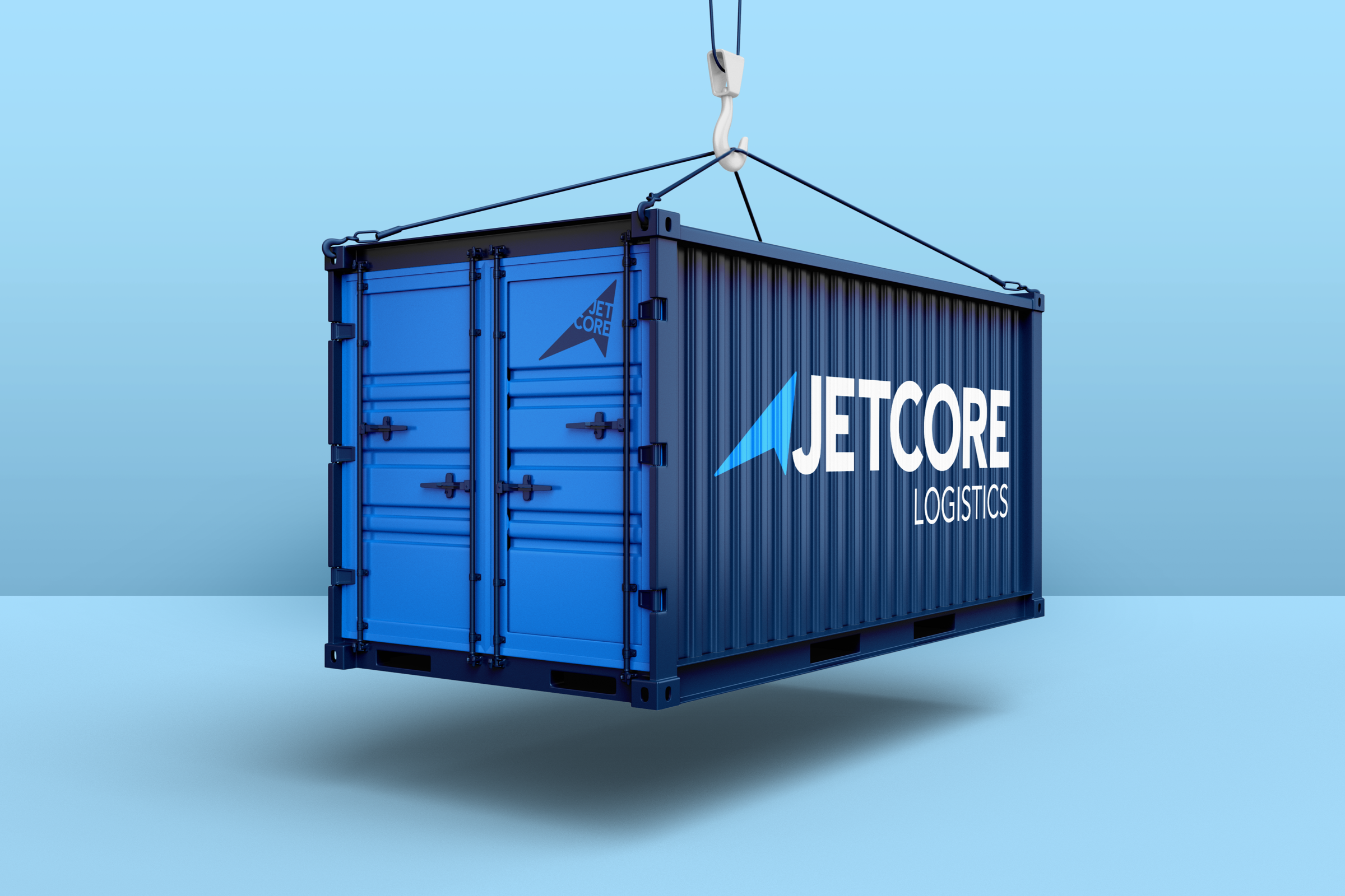
Creating a sense of forward movement
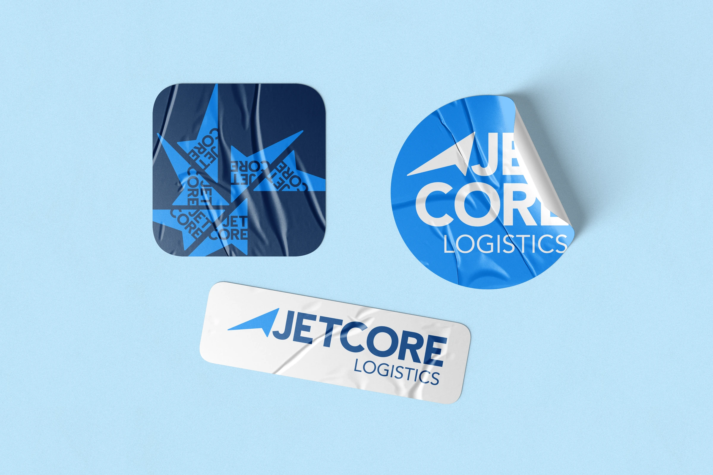
The concept is built from diagonal geometry that suggests direction, trajectory and forward movement. The tension between an extended base and an ascending point guides the eye forward and introduces speed without relying on trucks, roads or other literal category symbols. The same structure organizes the name within the mark and allows the identity to retain energy and recognition across horizontal, compact and diagonal configurations.
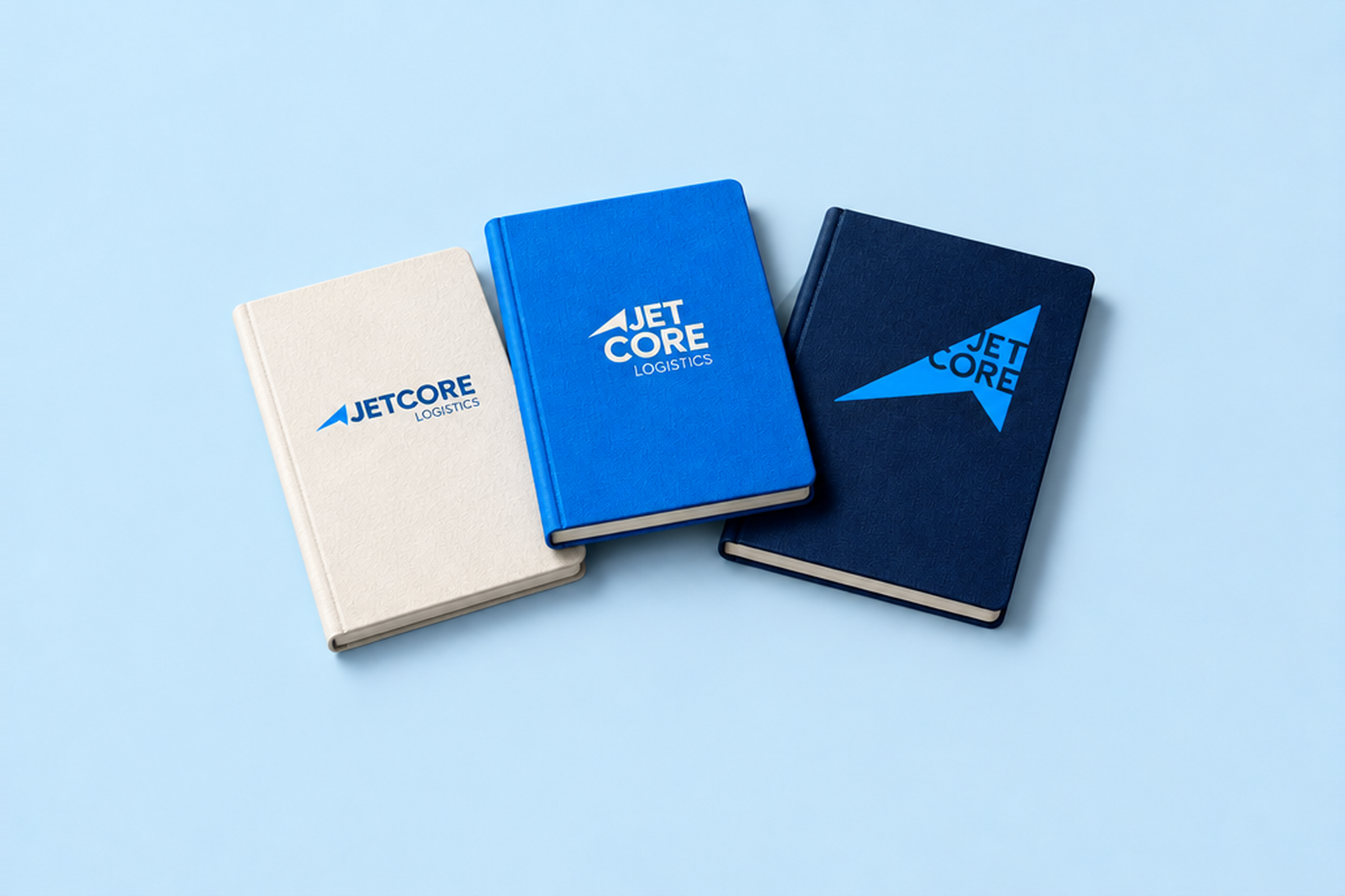
A flexible identity
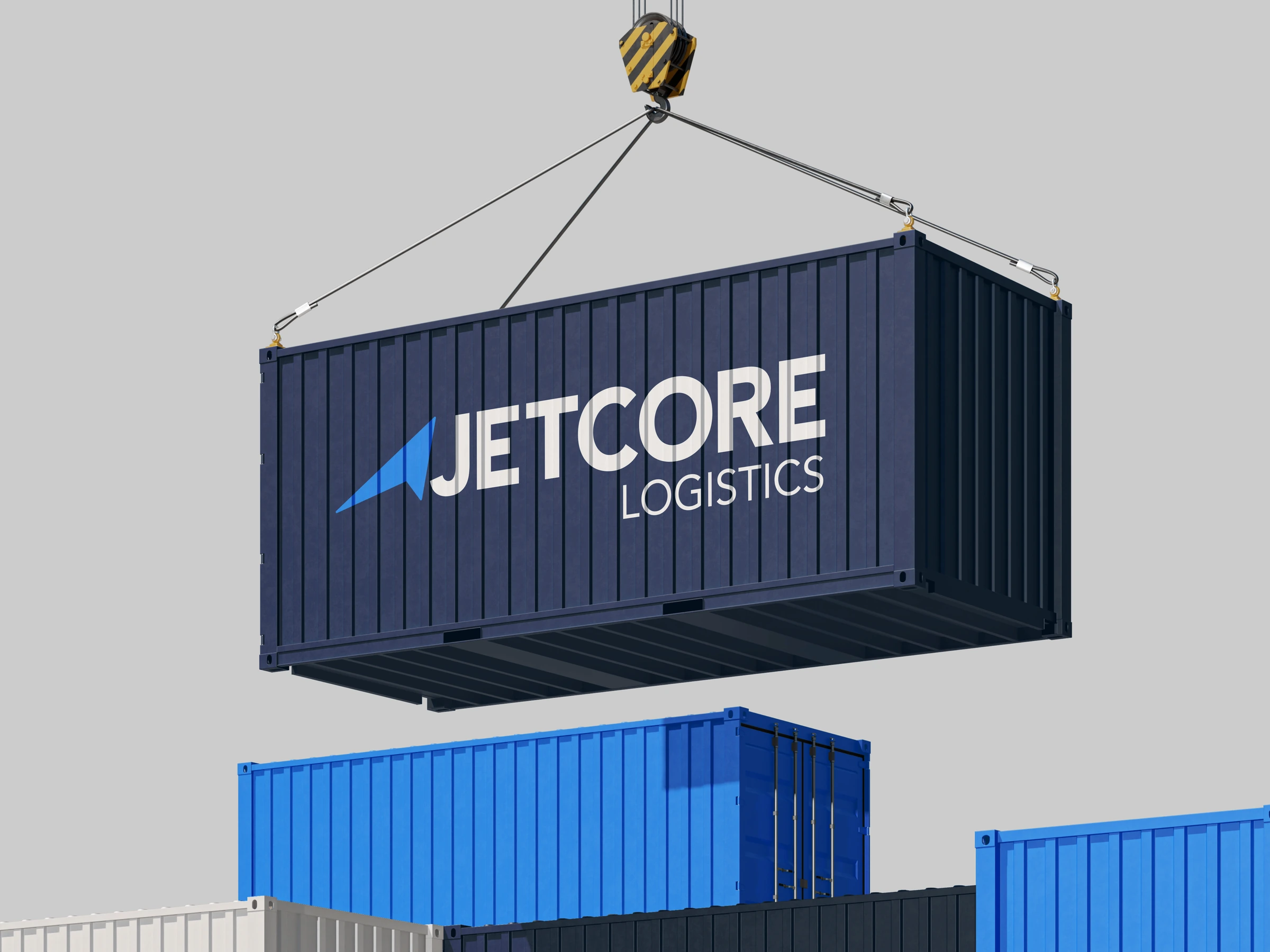
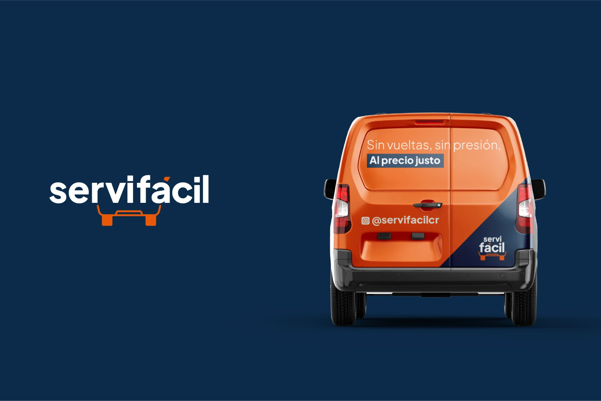
A blue-led palette separates the system into two complementary registers: electric blue brings energy and visibility, while navy adds weight and contrast. Horizontal, compact and diagonal configurations allow the mark to respond to different proportions without losing its directional character. The applications test that logic across stationery, containers, vehicles, packaging and digital screens.