Brand identity case study
RegulAD Medical Marketing
Turning regulatory rigor into an elegant medical-marketing brand
- Period
- 2025
- Role
- Brand Strategy, Naming & Identity Design
- Context
- RegulAD Medical Marketing
- Platform
- Brand identity
- Client
- Francisco Salas, founder
- Sector
- Scientific advertising for healthcare professionals
- Deliverable
- 15-page brandbook
- Implementation
- Not yet documented
Case summary
Francisco Salas founded RegulAD Medical Marketing from his experience in regulatory affairs, his training in pharmacy and his desire to build an independent specialist practice. The company would help pharmaceutical marketing teams communicate scientific information to healthcare professionals while navigating internal and regulatory approval requirements.
I created the name, brand concept, identity and verbal system around one central idea: regulation and advertising did not need to pull in opposite directions.

A business built between two disciplines
Pharmaceutical advertising needs to communicate clearly, but it also operates within demanding scientific and regulatory frameworks. Francisco identified delays and complexity in approval flows as a recurring problem. His value proposition was to make scientific information easier to understand while maintaining alignment with the applicable regulations.
As a new provider, RegulAD needed to feel trustworthy, serious and prestigious from its first appearance. At the same time, it had to look like a marketing partner capable of producing relevance and growth — not like an administrative compliance service.
Giving the proposition a name
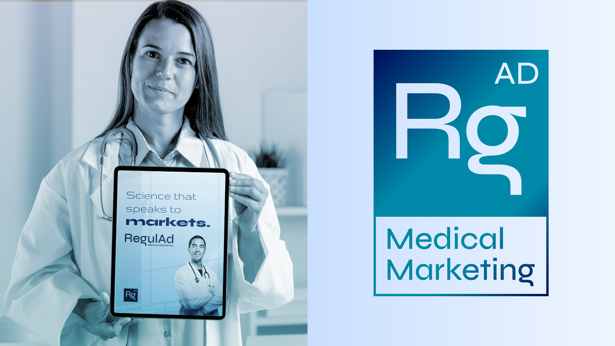
I created RegulAD by bringing the regulatory and advertising territories into a single expression. The name made the business model visible: regulatory clarity and scientific knowledge on one side; communication, markets and commercial impact on the other.
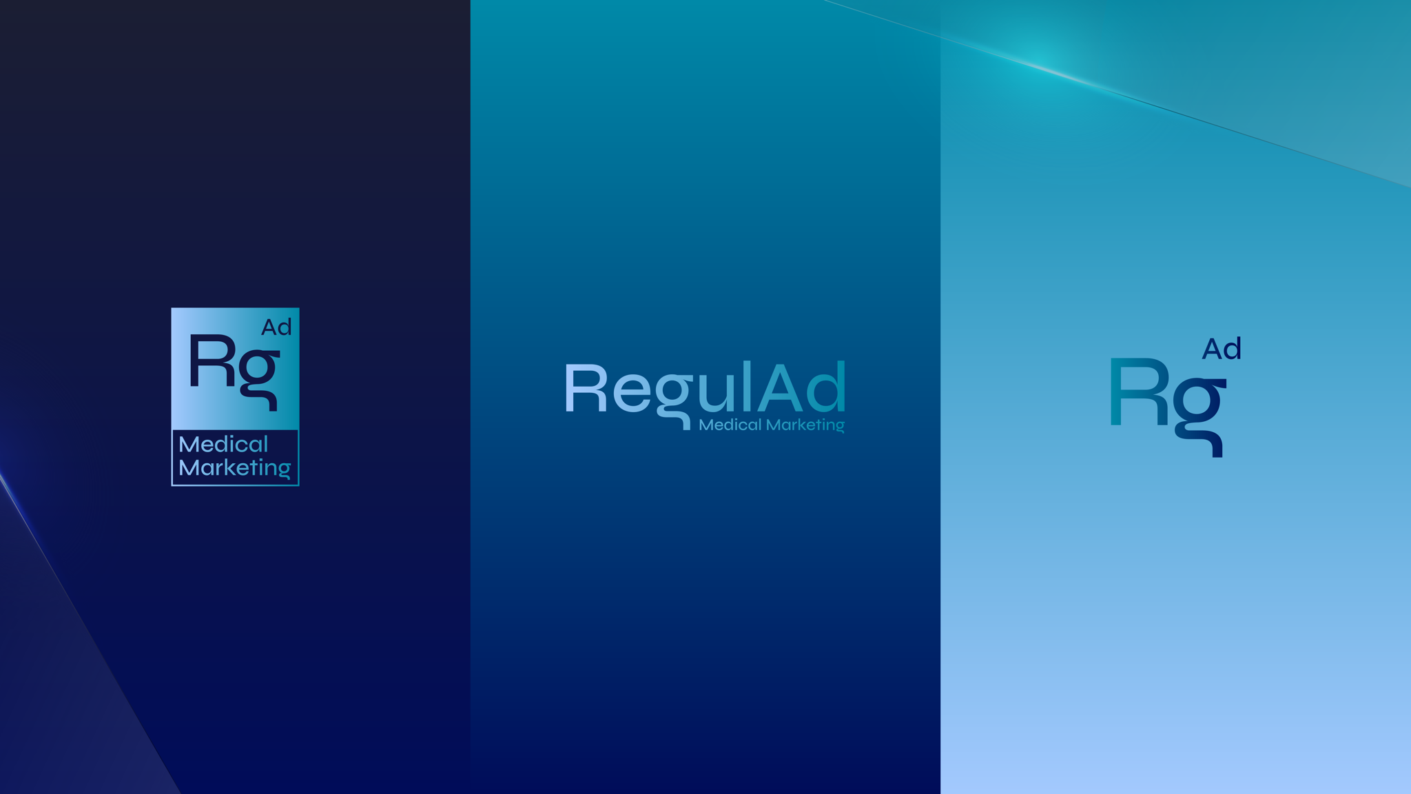
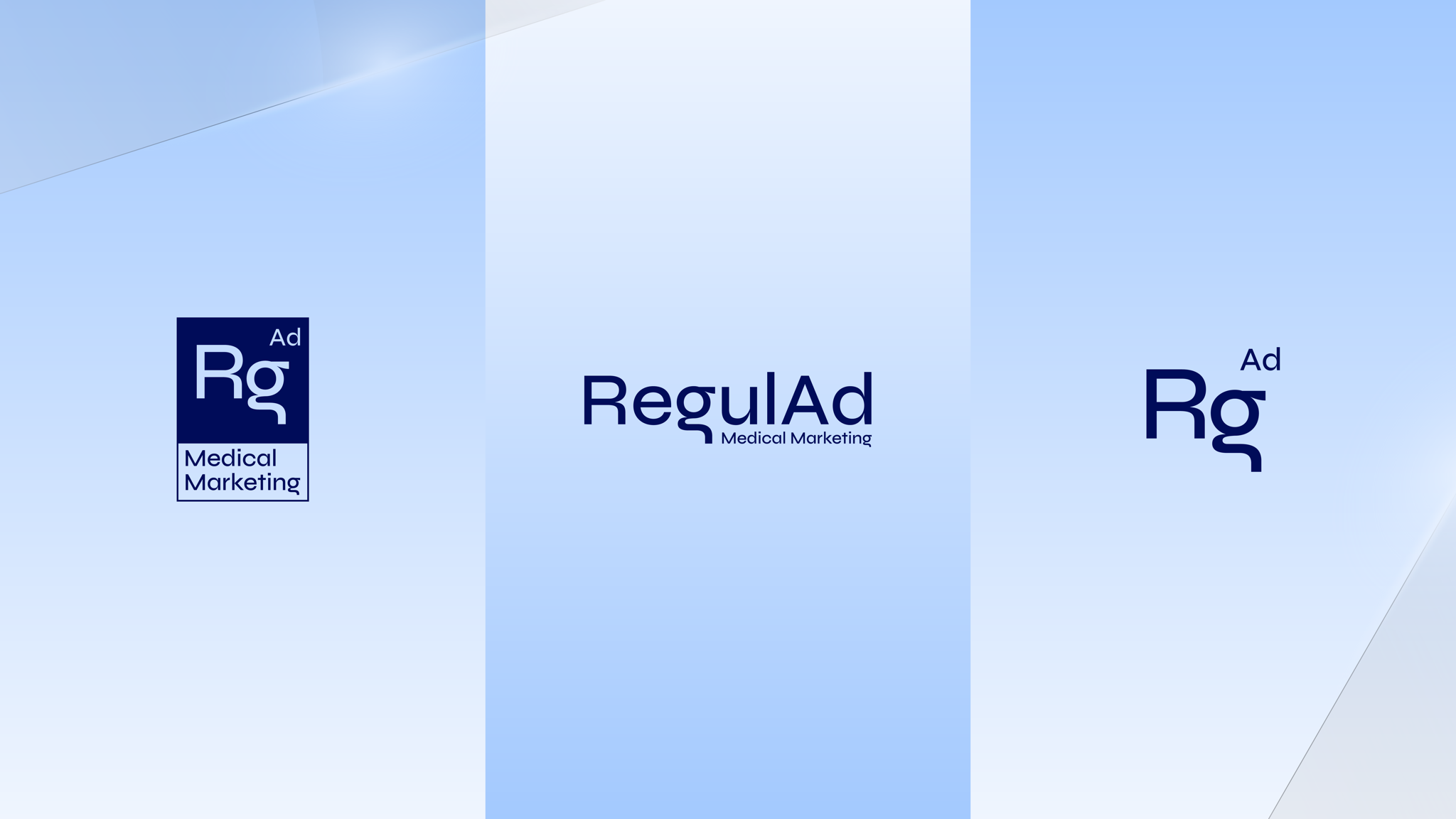
The compact Rg / Ad symbol extends the idea through a visual language associated with chemical elements and scientific notation. It gives the brand a recognizable shorthand without relying on a conventional medical cross, capsule or shield.
Finding the right degree of cleanliness
The hardest part was reaching a solution that felt almost antiseptic. The identity needed an exceptional level of order and cleanliness because of the hierarchy, precision and trust expected in its sector. But becoming clean could not mean becoming anonymous.
Once I found the selected typography, the proposal followed a consistent direction. Francisco liked the concept, so the work focused on refining its proportions, hierarchy and expression instead of moving through unrelated alternatives.
Building an elegant scientific system
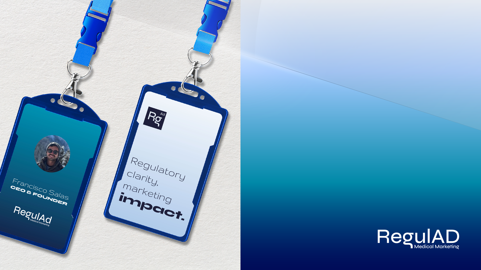
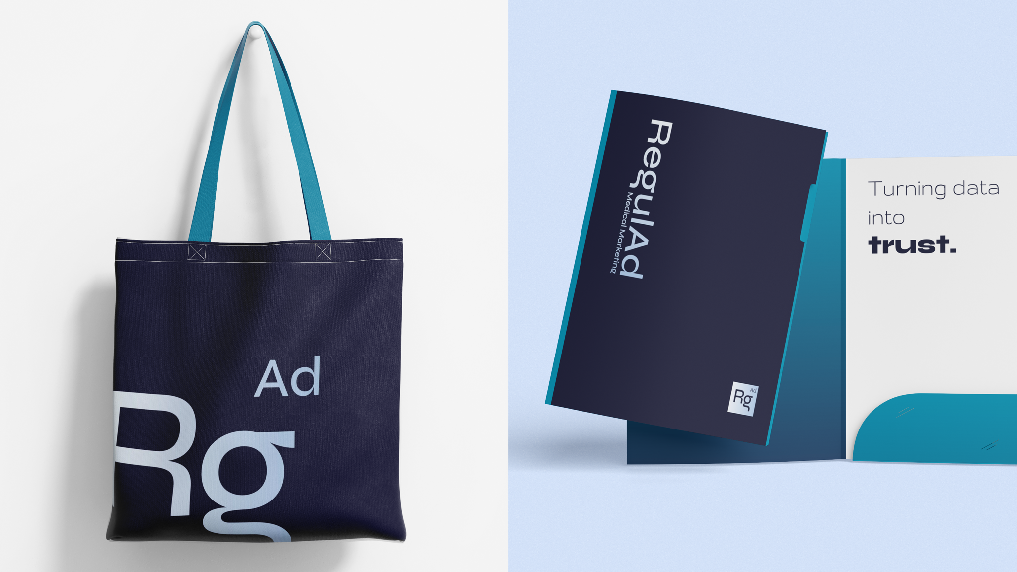
The wordmark uses a restrained construction supported by deep navy, cyan and pale neutrals. A three-part typographic hierarchy moves between technical elegance, accessible explanation and emphatic results. Translucent forms introduce a contemporary technological dimension while preserving the controlled visual atmosphere.
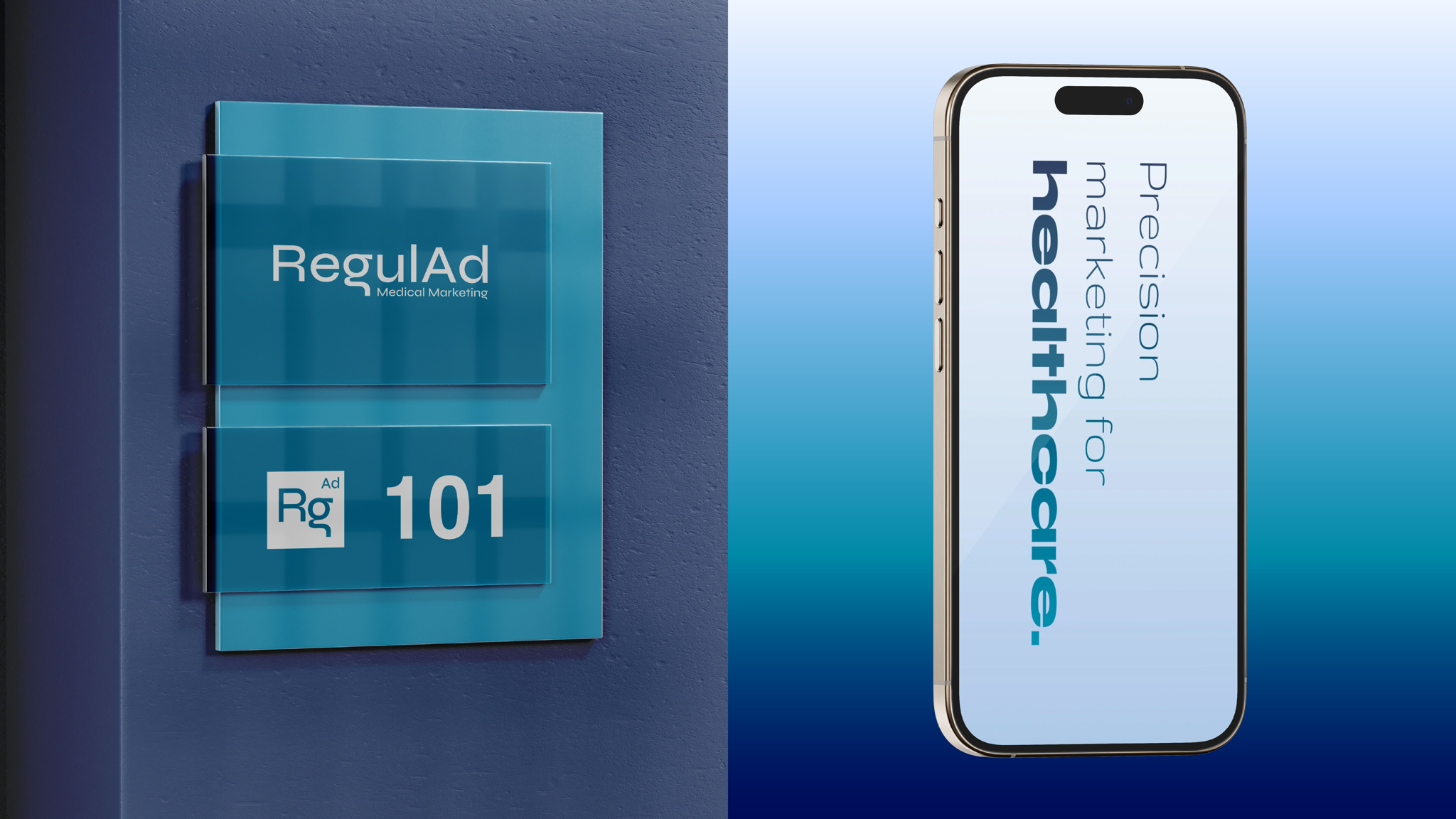
I also wrote a verbal system that connects regulation, science and marketing through ideas such as “compliant growth,” “science that speaks to markets,” “precision marketing for healthcare” and “turning data into trust.”


Reflection
RegulAD is the branding project that makes me most proud. The solution responds closely to the original objective, the concept holds together across every part of the system and the finished identity achieves an elegance that feels appropriate to both science and marketing.
Current status
Francisco approved the identity and I have explicit permission to publish the project. The available applications are brand mockups and should be presented as demonstrations of intended use; real-world implementation and business outcomes have not yet been documented.
Visuals in this case include: Mockup.