Brand evolution case study
Safe & Care
A physiotherapy identity evolved for a permanent clinic and a broader vision of care
- Period
- 2020 / 2025–2026
- Role
- Naming and Brand Identity Design
- Context
- Safe & Care
- Platform
- Brand identity
- Original identity
- 2020
- Redesign
- 2025, approved by Paula
- Implementation
- Planned for a clinic expected to operate in 2026
- Portfolio publication
- Authorized 2026-08-22
Case summary
I proposed the Safe & Care name and created its first identity in 2020 for Paula Vargas's physiotherapy services. Five years later, Paula was preparing to move from a home-based practice into a permanent commercial clinic in Alajuela and bring her offering closer to aesthetics.
The brand needed to evolve with that ambition without losing the visual idea that already belonged to it.
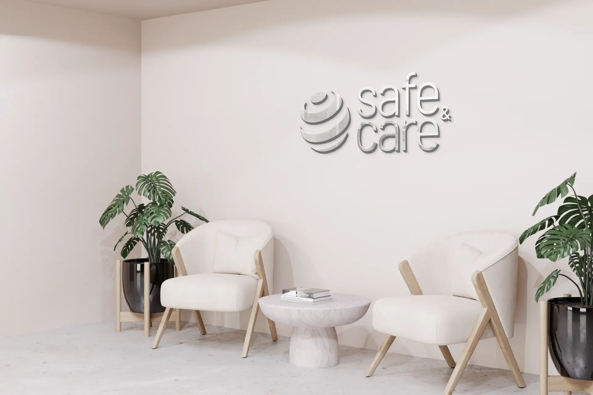
Preserving a recognizable core
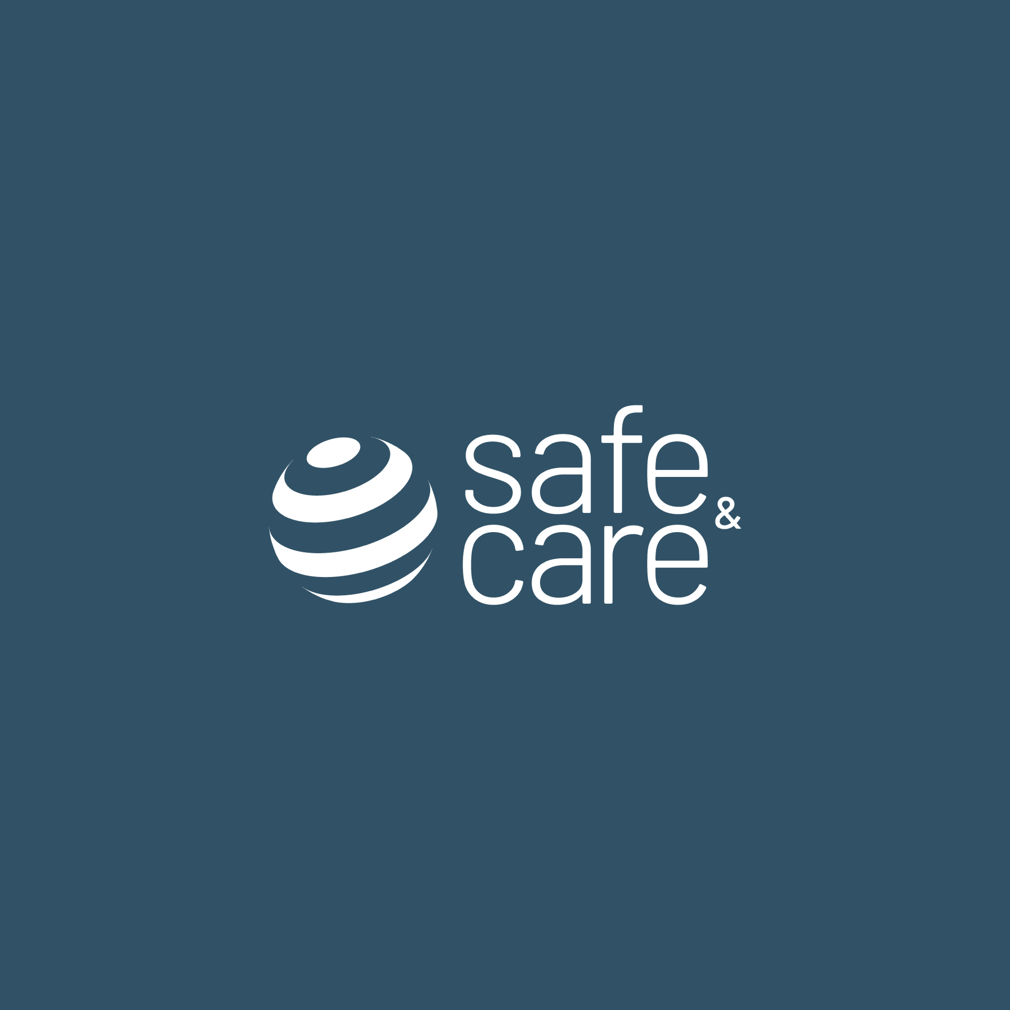
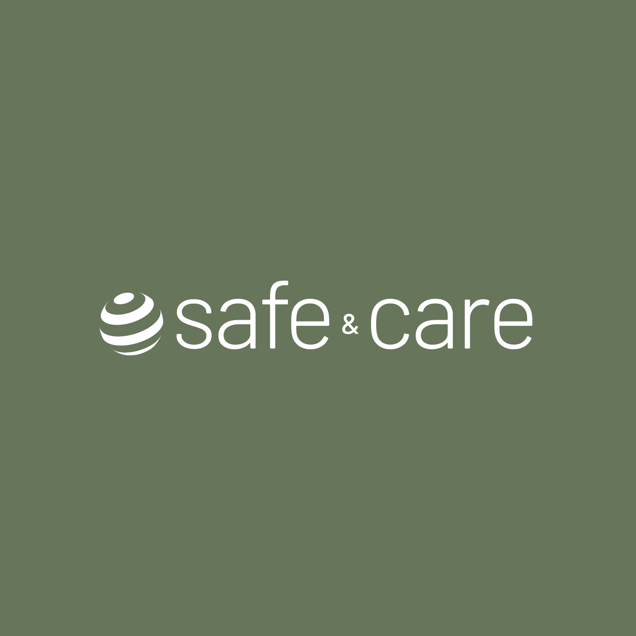
The spherical symbol represents a therapeutic ball, a holistic approach and the unity of the body. Rather than replace it, I refined its construction: the outlined form became simpler and more solid, giving the mark greater presence while preserving continuity with the original identity.
Opening the identity to a new stage
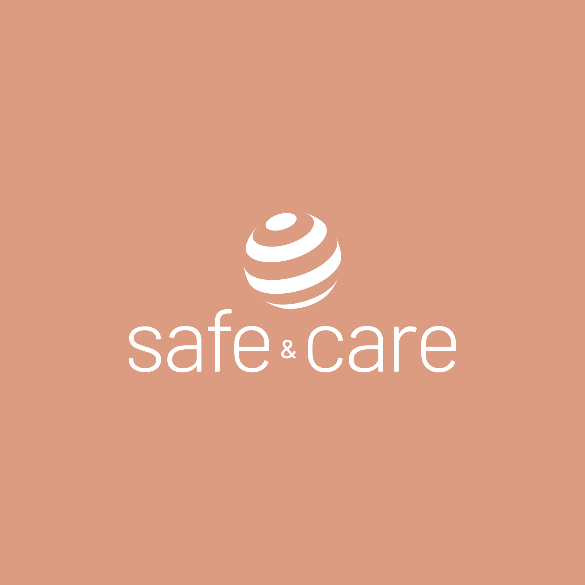
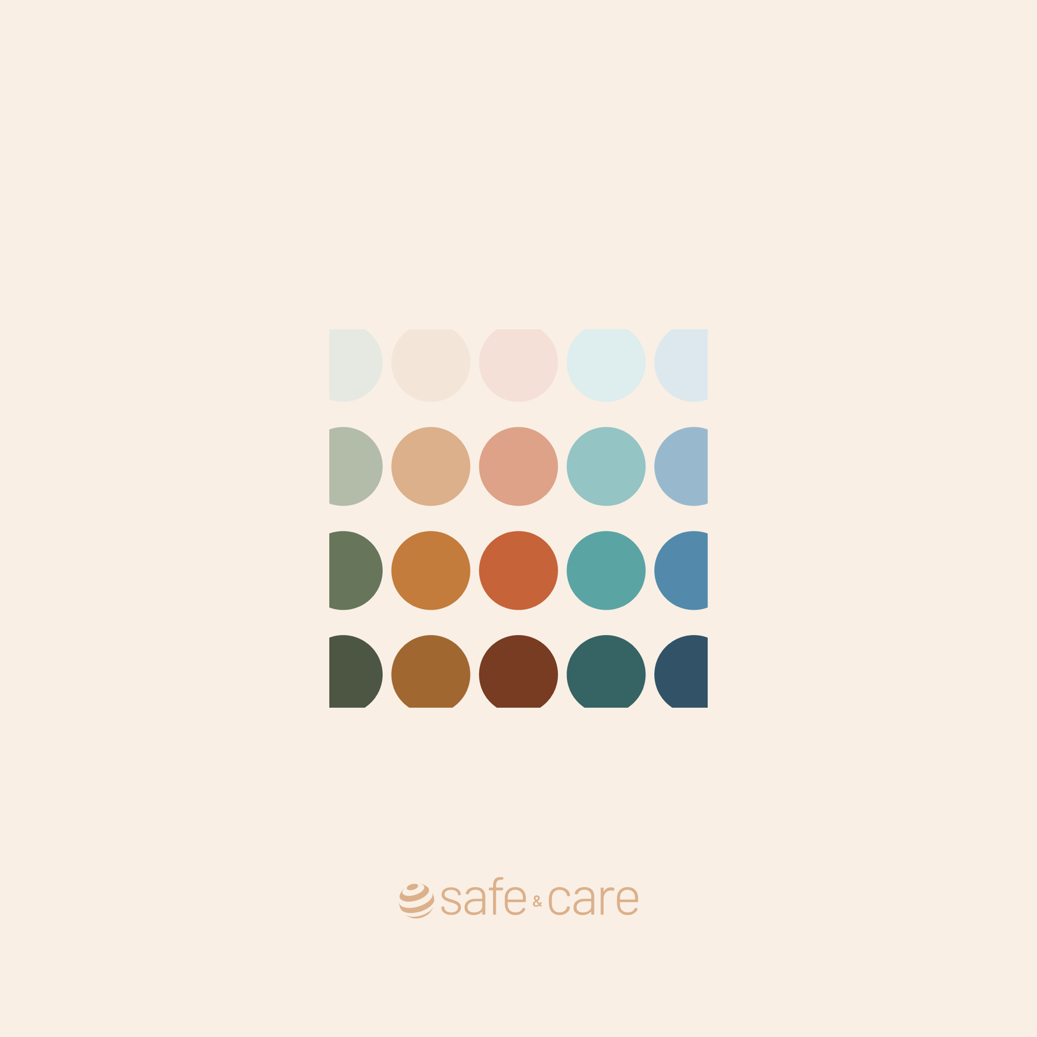
The earlier identity was explicitly labeled Physiotherapy. Removing that descriptor allowed Safe & Care to support a broader vision of care. A lighter wordmark, horizontal and stacked configurations, and an expanded palette gave the system more range and a more current aesthetic.
The palette was designed to express the personality of Paula's service. Its broader range also creates flexibility for future spaces and applications without depending on a single clinical color.
Designing for a highly visual client
The most difficult part was preserving the identity of someone who pays close attention to aesthetics. The result needed to feel updated and refined, but still personal to Paula and recognizable as Safe & Care.
Outcome
Paula approved the redesign in 2025. Its implementation is planned for the new Alajuela clinic expected to operate in 2026. The current environmental and product scenes are therefore presented as mockups of the intended brand experience, not photographs of a completed installation.
2020 original identity → 2025 approved redesign → 2026 planned implementation
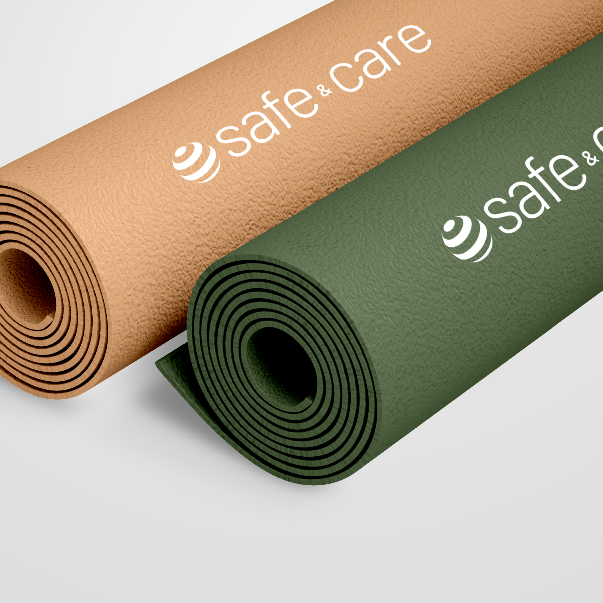
Visuals in this case include: Mockup.
Explore other work
Product case study
Parq.ai
AI brand and product design system
GIA Studio
New brand creation + launch system
ServiFácil
Visual identity mini case
Jetcore Logistics
Brand redesign case study
Arhmon Fotografía
Brand identity case study
RegulAD Medical Marketing
Brand identity case study
MAS — Ministerio Alto y Sublime