Brand redesign case study
Arhmon Fotografía
A photography identity redesigned to frame real family moments
- Period
- 2026
- Role
- Brand Identity Design
- Context
- Arhmon Fotografía
- Platform
- Brand identity
- Client
- Mónica Huertas
- Timeline
- Discovery late 2025 · Project completed 2026
- Deliverable
- 15-page brandbook
- Permission
- Portfolio use explicitly authorized
Case summary
Arhmon Fotografía was already an active photography business when I was asked to redesign its identity. Its name carried an intimate family story, combining Arias, Huertas and Mónica, while its work focused on maternity, babies, children and families.
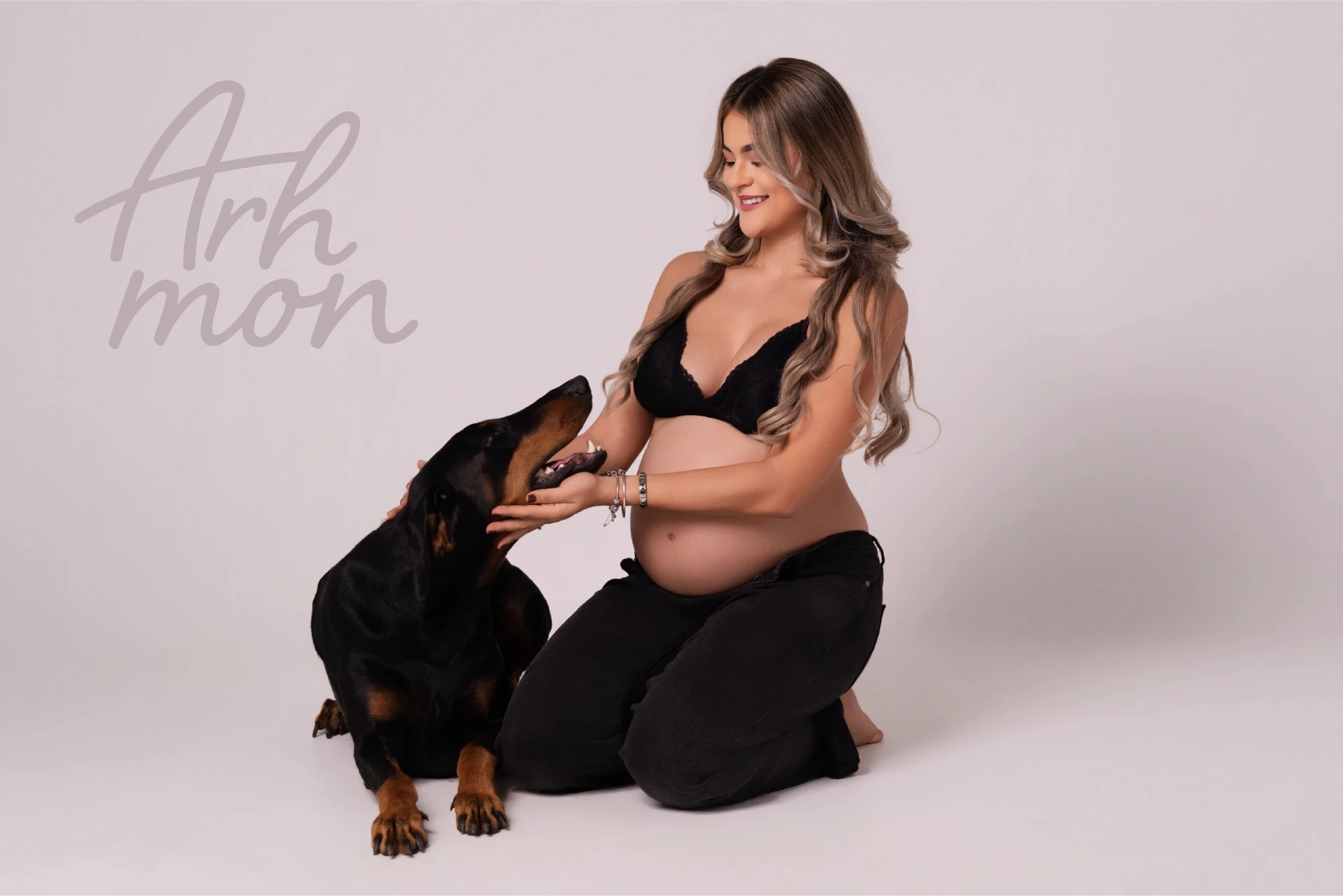
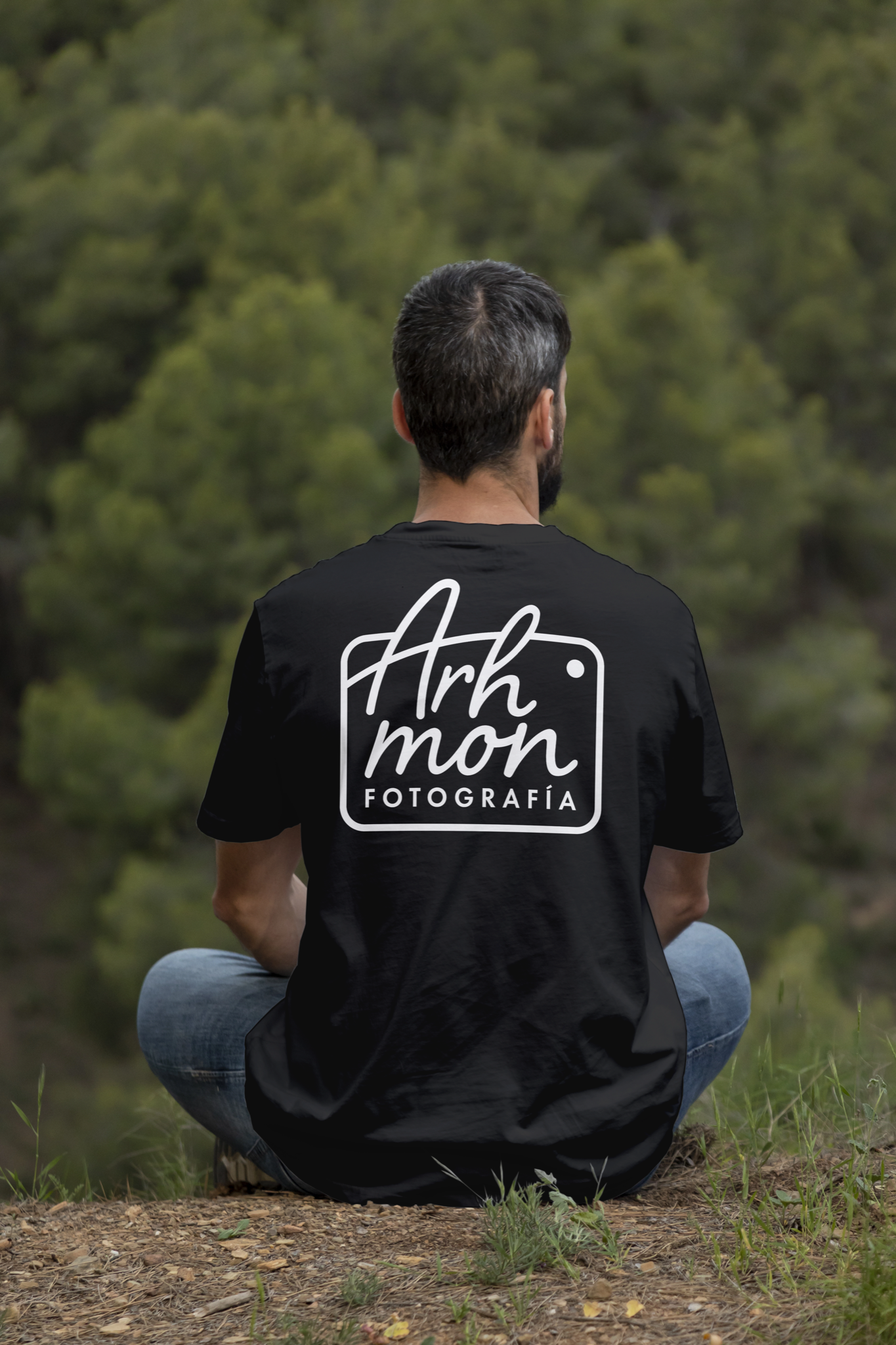
The redesign moved from a more ornamental identity toward a clearer handwritten mark framed by the outline of a camera.
Moving beyond a generic identity
The previous logo was difficult to read and felt generic, carrying the visual sameness of some early AI-generated identities. The redesign needed to improve recognition while giving the business a voice that felt closer to Mónica and the families she photographs.
The original brief prioritized families and children, accessible pricing, creativity, free style and joy, with a desired feeling of freedom for spontaneous, natural poses.
Finding the right structure
The name Arhmon naturally produced a long horizontal composition. My first proposal reorganized it into a compact camera shape using serif typography. Although neither Mónica nor I felt that direction was right, it revealed the structural solution: the camera could give the name a more balanced, square footprint.
From typography to a personal mark
I kept the camera structure and explored six different typographic approaches. Starting from a typeface, I drew and adjusted the selected lettering myself. Its organic lines allowed the name to integrate with the camera instead of simply sitting inside it, replacing the rigidity of the serif concept with something warmer and more spontaneous.
Building beyond the logo
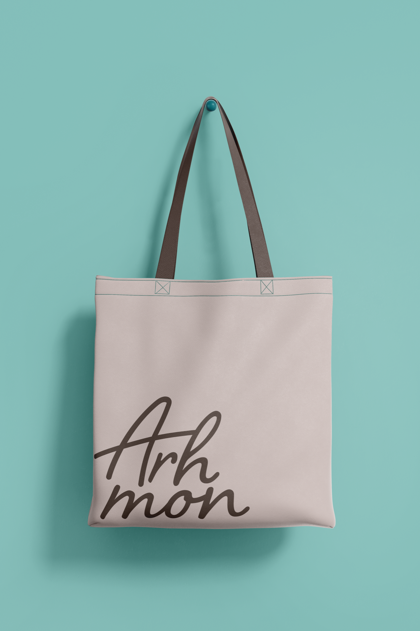
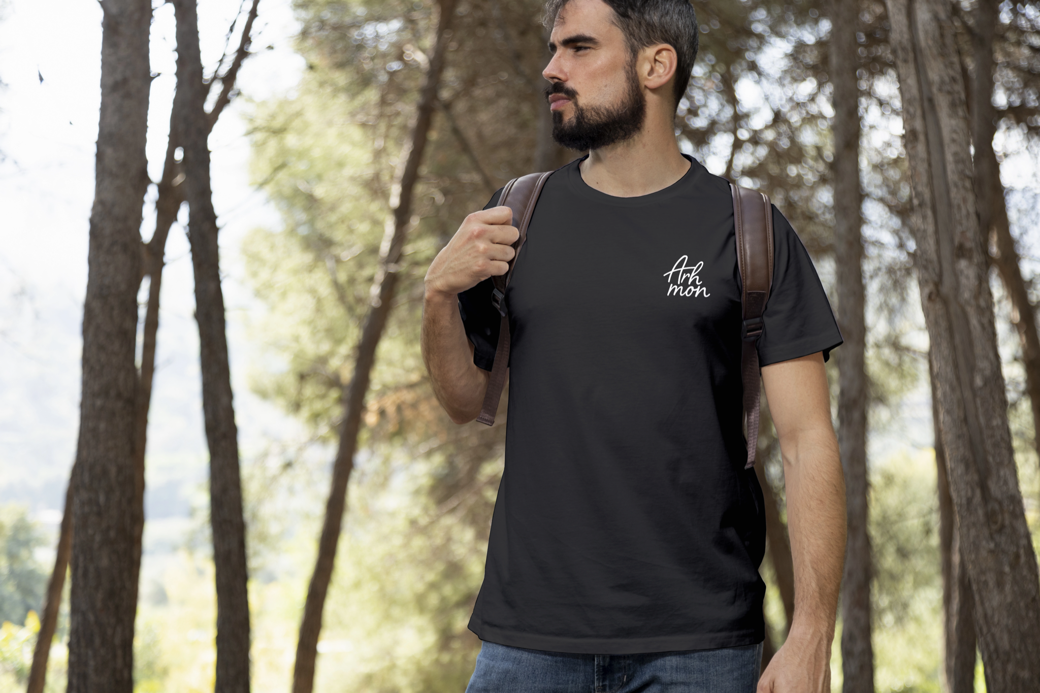
The final identity includes principal, secondary and tertiary configurations, a palette of warm neutrals and fresh accents, a supporting typographic hierarchy, photographic direction and graphic resources. I also wrote a set of narrative phrases centered on real moments, emotion and memories that endure.
Together, these elements create a system designed to frame the work without taking attention away from the photographs.
Current status
Mónica approved the final identity. Arhmon remains an active photography business focused on maternity, babies, children and families, and the logo has been implemented selectively in some materials, including a printed application displayed in the studio.
The broader system has not yet been deployed consistently across every public touchpoint, so the case distinguishes the completed identity, its intended applications and the real adoption achieved so far.
Visuals in this case include: Mockup.