Brand identity case study
MAS — Ministerio Alto y Sublime
A contemporary redesign for a large Christian community
- Period
- 2025
- Role
- Brand Identity Design
- Context
- MAS — Ministerio Alto y Sublime
- Platform
- Brand identity
- Client contact
- Allan Vega, worship ministry director
- Deliverable
- 15-page brand book
- Approval
- Approved with adjustments; direction remained consistent
- Implementation
- Implemented by MAS; real evidence to be selected
Case summary
MAS — Ministerio Alto y Sublime was already an established ministry when Allan Vega, director of its worship ministry, commissioned me to redesign its identity.
The challenge was to create a system for a large Christian community without relying on the visual conventions typically associated with churches.
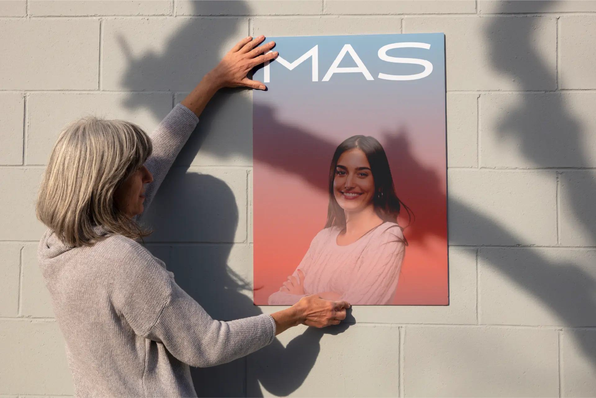
More than a name
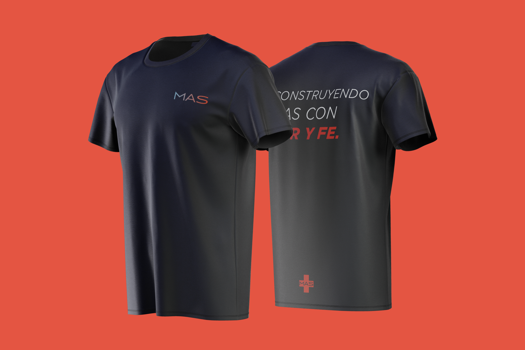
The existing MAS acronym became the foundation of the redesign. The + adds a double meaning: it functions as the mathematical sign for “more” while also referencing the Christian cross. This allowed the identity to remain contemporary and minimal without losing its religious significance.
A system for community scale
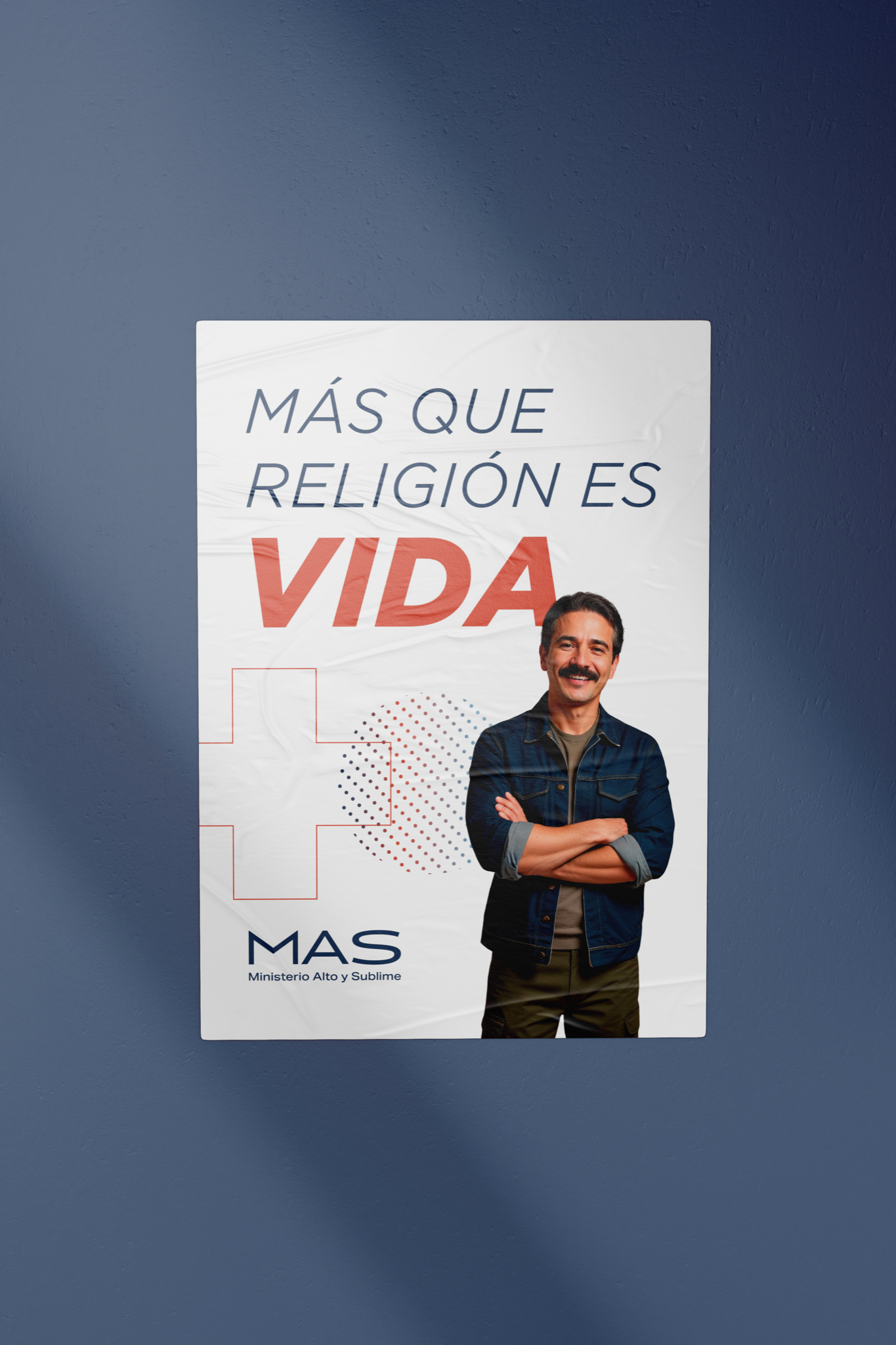
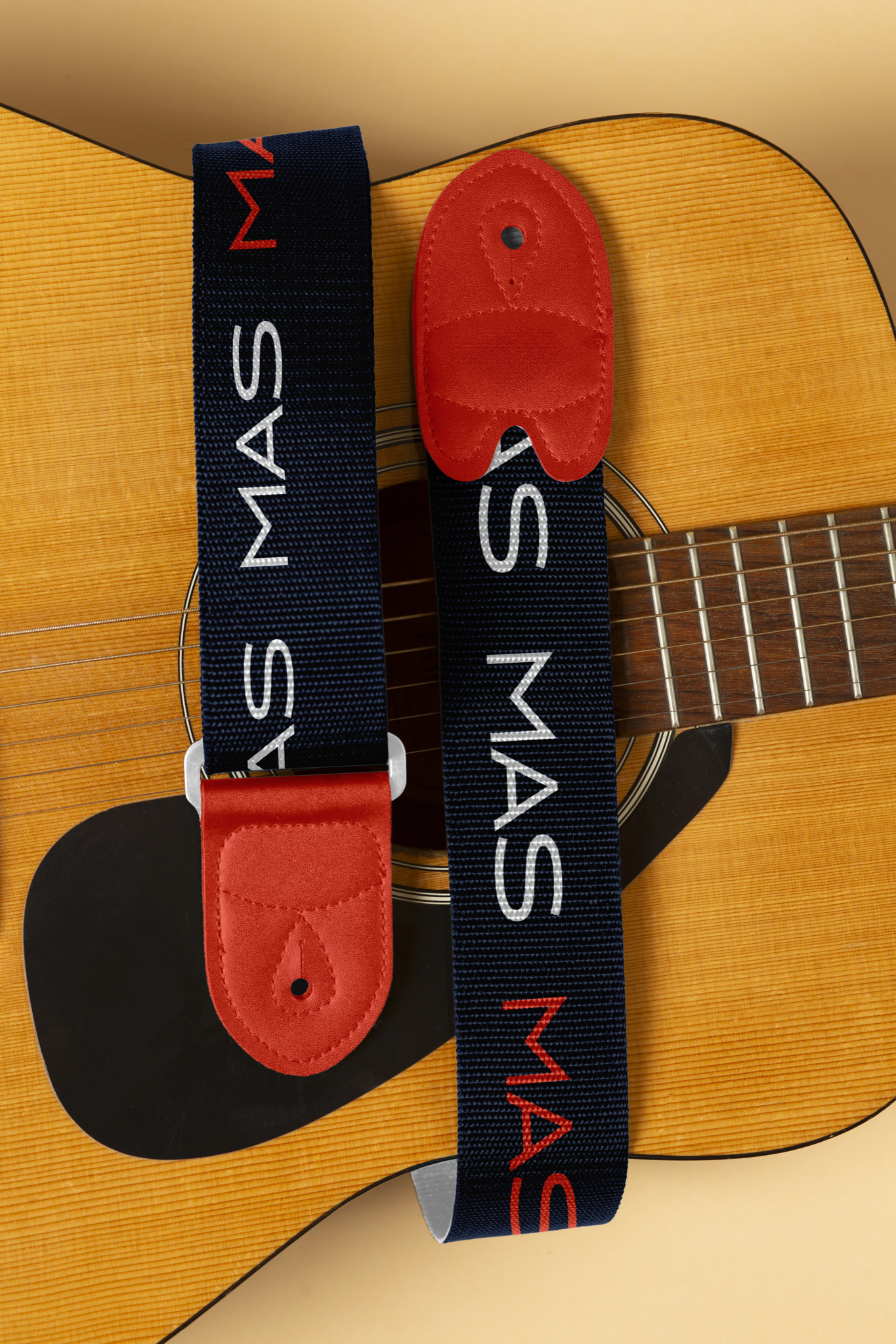
Primary, secondary and symbolic logo versions support both institutional and expressive communication. Dark blue brings stability, while light blue and orange introduce openness, warmth and energy. Typography, an approachable photographic direction, geometric elements and short phrases extend the system beyond the logo.
The phrase “Más que religión es vida” came from MAS and helped anchor the verbal tone of the identity.
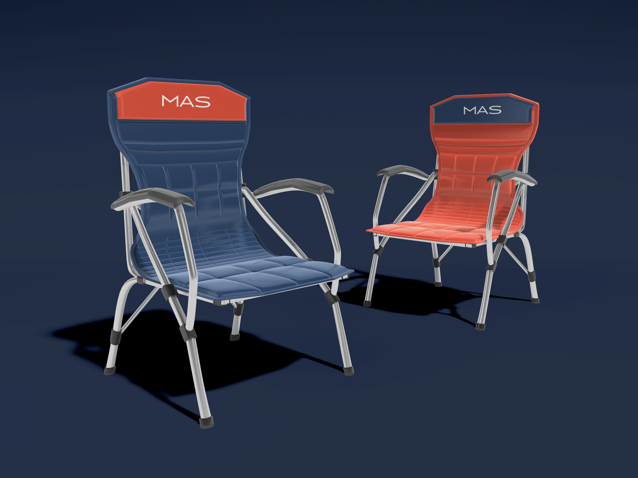
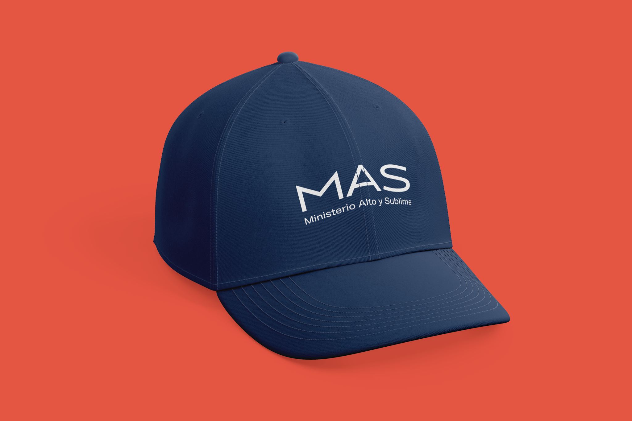
Designing outside convention
Avoiding a traditional church aesthetic was intentional. The most difficult part was the responsibility of developing a religious identity that would represent a very large community. The solution needed to feel current and accessible while remaining credible to the people already connected to the ministry.
Outcome
The original direction was well received and remained substantially consistent through a series of adjustments. MAS approved and implemented the identity, and I have permission to present the project in my portfolio.
Individual scenes in the brand book remain mockups until matched to real evidence, and no measurable community or organizational result is claimed.
Visuals in this case include: Mockup.